
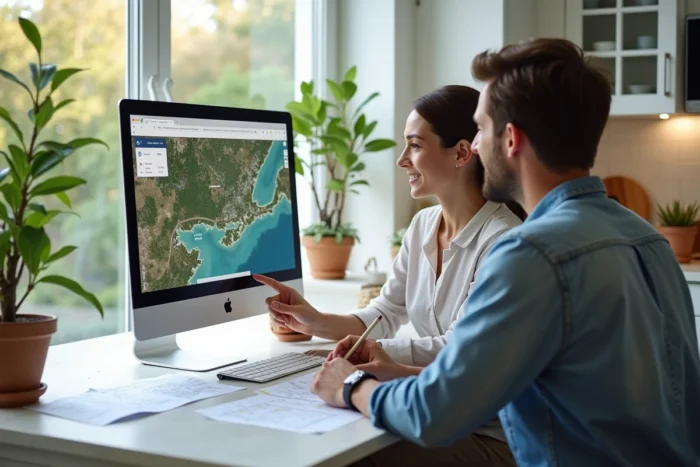
Even before visiting a property, you can already know how much sunlight it receives. Google Maps, combined with a few complementary tools, allows you to estimate the sunlight exposure of a house, season by season, without stepping foot on site. The principle relies on satellite view, elevation data, and shadow simulators that exploit these same maps.
Simulating Shadows on a Plot with 3D Data
Most articles on the subject stop at reading the cardinal orientation. Identifying north at the top of the screen is a starting point, not a simulation. What really changes the game is taking into account the shadows cast by neighboring buildings, trees, and the terrain.
Tools like Shadowmap leverage Google’s 3D tiles and Stadia Maps to calculate the shadow cast on a facade or garden, hour by hour, over 365 days. The result takes the form of a Sunscore (from 0 to 100) that reflects the actual amount of sunlight received at a specific point. Some real estate platforms, including Redfin and Willhaben, already integrate this type of score into their listings.
Specifically, you enter an address, choose a date and time, and the map displays the shadow areas in real-time. You can thus compare a south-facing second-floor apartment, surrounded by buildings, with a southwest-facing house with no overlooking. The former may receive less light than the latter, despite a theoretically better orientation.
The sunlight simulation with Google Maps becomes particularly interesting when we go beyond the simple compass to integrate these obstruction data.

Google Solar API: Estimating the Solar Potential of a Roof
Are you considering photovoltaic panels? Google has developed a Solar API (from the Sunroof project) that goes well beyond cardinal orientation. This tool analyzes the geometry of the roof, the slope of each plane, surrounding shading, and local weather data to produce an estimate of solar potential.
The API incorporates local weather history, meaning it doesn’t just calculate the angle of the sun. It weighs the result by the average cloud cover in your geographic area. A south-facing roof in Lille and the same roof in Montpellier will not produce the same energy, and the tool reflects that.
What the Solar API Calculates for You
- The usable area of each roof plane, excluding areas shaded by chimneys, trees, or nearby buildings
- The number of hours of useful sunlight per year, weighted by the actual weather of the area
- An estimate of possible energy production, expressed based on the power of the proposed panels
This approach is significantly more reliable than a manual calculation based solely on orientation. The shading from a mature tree can reduce the production of an entire plane, an invisible factor on a simple satellite view.
Mobile Applications to Simulate Light Room by Room
Google Maps provides an aerial view. To understand what happens inside a dwelling, a new generation of applications takes over. Tools like Sunlight Sim or Sun Pathway combine the position of the sun, mapping data, and sometimes 3D models to simulate light in a room or on a balcony.
The principle: you point your phone at a window or facade, and the app overlays the sun’s trajectory on different dates of the year. You can see at what time the sun enters the living room in December and when it disappears behind the building across the street in June.
An annual light score summarizes the amount of sunlight received, season by season. It’s a valuable complement to the satellite view of Google Maps, which only shows the tops of roofs.
When to Use These Applications Instead of Google Maps
You visit an apartment on a rainy day in November. The perceived brightness does not reflect the summer reality. By launching a simulation on your phone, you can project the sunlight of July and see that the living room receives direct sunlight for several hours in the afternoon.
Conversely, a property bathed in light during a visit in June may find itself in the permanent shadow of a neighboring building from November to February. The seasonal simulation avoids this classic trap of the single visit.
Calibrating Your Google Maps Compass for Reliable Results
Have you ever noticed that the blue arrow on Google Maps sometimes points in the wrong direction? A poorly calibrated compass skews any orientation analysis. Google has added a camera calibration mode (Live View) and the classic eight-figure method, which involves moving the phone in a figure-eight motion to reset the magnetometer.
- Activate camera calibration in Google Maps by pointing your phone at the surrounding buildings. The app uses visual recognition to correct the orientation
- Move away from any magnetic source (car, metal structure, Bluetooth speaker) before starting the calibration
- Check consistency by comparing the compass indication with the position of the sun if the sky is clear
Without correct calibration, the orientation error can reach several tens of degrees, enough to confuse a southeast exposure with an east exposure.
The combination of Google Maps in satellite view, a 3D shadow simulator, and a solar trajectory application covers the vast majority of needs. Each tool answers a different question: overall orientation, actual obstructions, and indoor light. None of them replace an on-site visit at different times, but together, they transform intuition into actionable data even before the first move.